Jeff Mutschler

Jeff Mutschler

I design it
and I build it.

Designer. Developer. 30+ years.
Thank you Austin, Texas.

Thirty-two years of design and development across Austin, Texas and everywhere else. I have helped design Willie Nelson's and Soundgarden's first websites, architected supplier portals for 60,000 General Motors global suppliers, produced commercial audio for national recording artists, designed hundreds of logos, branding, websites, t-shirts, book covers, CD, cassette, LP and poster artwork, technical documentation from deep engineering specs to consumer marketing materials, and built enterprise software now running in air-gapped facilities around the world. Most people have to choose between designing and building. Have both. Let's connect on LinkedIn and please browse my work below.

2020s
2020s
Volume Dealer

Volume Dealer

Volume Dealer is a free loudness maximizer built around one correct answer to the loudness question: measure in LUFS, target in LUFS, limit in true peak. It does not guess. The integrated LUFS meter runs continuously, auto-gain targets whatever LUFS level you set, and a brickwall true peak limiter hard-stops at -0.01 dBFS. Short-term and momentary readouts give real-time visibility into dynamics without forcing math during a session.

BS.1770-3 and BS.1770-4 are both supported. Dithering at 24-bit and 16-bit. Standard and high quality modes. Latency at 5.9ms. The green machine aesthetic - dark green panel, seven-segment LED readouts, brushed rack hardware - was deliberate. It should feel like broadcast infrastructure, not audio software.

Free plugins that look this serious tend to spread on their own. That is the point. Volume Dealer is the top-of-funnel piece in the M Media Audio catalog - the thing that shows up in a session, does exactly what it says, and makes people look up who built it. The answer is on the panel.

The Mad Scientist

The Mad Scientist

The Mad Scientist is a tube compressor that doesn't pretend to be something it isn't. The steampunk hardware aesthetic - riveted copper plate, vacuum tubes, hand-machined fittings, amber-glow VU meters - was not a marketing decision. It was the answer to a design question: what would this hardware look like if a Victorian engineer had built it for a modern studio? The result belongs in a museum and works in a mix simultaneously.

The controls are dense because the plugin is dense. Gain, threshold, attack, release, knee, auto-release, mix, output, and mode - all visible, nothing hidden behind menus. TUBE COMPRESSOR is the subtitle. The character is the point. Most engineers who put this on a buss track for the first time leave it there permanently.

The GUI was designed so that everything a compressor engineer needs is immediately readable without clicking anything. The two large VU meters dominate the panel because in tube compression, watching the meters IS the process - the attack of the needle, the hang time on release, the point at which the gain reduction starts to feel musical rather than corrective. All of that is visible at a glance. At $39 it costs less than the breakfast you ate before the session.

Violet Crown

Violet Crown

Violet Crown puts a full 3-band EQ and a compressor in one rack unit and gives you control over which runs first. The LOW, MID, and HIGH bands each have independent boost/cut and parametric frequency controls with shelving and cut options. The compressor adds threshold, gain, hard/soft knee, and independent fast/slow attack and release. The Eq→Comp and Comp→Eq routing switch lets the signal chain run either direction - which changes the character of everything downstream.

The dark anodized panel, precision white callouts, and dual VU meters read like API or Neve hardware: the kind of equipment that gets inherited from studio to studio because nobody can justify replacing something that still works. The name is Austin. The design is Austin. The plugin is sold everywhere.

At $29 it is the deepest plugin in the catalog and probably the one that gets the most use on mix busses, master chains, and parallel processing racks where having an EQ and a compressor in a single calibrated unit saves routing headaches without sacrificing control. The interface shows you everything at once. Nothing is collapsed, nothing requires a sub-menu. What you see is what the signal is doing.

VST3 Audio Plugins

VST3 Audio Plugins

The visual identity for M Media Audio was built around one principle: the work should look as serious as it sounds.

The palette uses near-black backgrounds, warm amber accents, and tight system typography, deliberately avoiding the overused neon synth-wave look common in audio software. The mmediaaudio.com site is a fully custom WordPress theme, with every layout, component, and CSS rule written from scratch. The result feels more editorial and hardware-focused than typical plugin marketing, closer to premium product presentation than disposable software promotion.

The three plugin GUIs use photorealistic rack hardware styling, designed to feel like equipment that has lived in a real studio. Aged dark metal, parchment VU meters, authentic markings, red zones, worn surfaces, amber LEDs, and consistent wordmark placement create a unified product family while allowing each plugin to stand apart. Alternate Timeline is the most complex interface, with ERA selection, input metering, dual VU meters, saturation indication, bypass, and a full row of hardware-style controls arranged with real-world ergonomics in mind. Speaker Breaker and Velvet Crush are intentionally minimal, using a power toggle, Mix knob, VU meters, and a clear OVERLOAD indicator to communicate their purpose immediately.

The marketing system extends the same visual language across hero images, product screenshots, compatibility logos, trust badges, article cards, WooCommerce templates, FAQ sections, and mobile layouts. Eighteen SVG DAW and technology logos were assembled and styled for the compatibility scroller. The site also includes custom-built UI components such as a touch-enabled auto-advancing slider, plugin grid cards, checkout templates, and trust bands, all designed without page builders, grid libraries, or front-end frameworks.

Satellite Operations Trace System

Satellite Operations Trace System

There is a category of software where the cost of an undetectable execution error is not a degraded user experience but a mission failure. SOTS was built for that category.

The Satellite Operations Trace System is a governed execution and tamper-evident trace daemon for satellite and aerospace operations teams. Every command issued, every agent action taken, every system response is hash-chained, AES-256-GCM encrypted, and permanently recorded - in sequence, on-premises, with no cloud relay, no telemetry, no third-party dependency. If something happened, the ledger proves it. If the ledger was tampered with, that is also provable.

The hash chain runs SHA-256 across sequential entries: each record includes the hash of the prior record, making any retroactive insertion or deletion mathematically detectable. AES-256-GCM provides authenticated encryption at rest. HKDF handles key derivation. The daemon runs as a single Go binary on Windows, Linux, and macOS - no runtime dependencies, no package manager, no container required. In air-gapped facilities where outbound network connections are prohibited or treated as indicators of compromise, that deployment profile is not a preference but a requirement.

SOTS is priced at $24,000 per deployment per year. That number reflects the market it serves, not the size of the codebase. The organizations buying this software have procurement cycles, compliance mandates, and a legal obligation to demonstrate chain of custody over every action taken inside their operational stack. The gap between what exists and what aerospace operations teams actually need is the product.

Agent Action Ledger

Agent Action Ledger

The question the enterprise AI market cannot currently answer is: what did the agent actually do, and can you prove it?

The Agent Action Ledger is an AI governance daemon that answers that question. Every action taken by an AI agent - every API call, every capability invoked, every decision made and logged - is written to a hash-chained audit ledger that is mathematically tamper-evident and cannot be retroactively modified without detection. The chain runs SHA-256 across sequential entries. Bcrypt handles authorization. The daemon is MCP-native, integrating directly into the Model Context Protocol toolchain that serious AI agent deployments are standardizing on. No cloud. No relay. No SaaS subscription required to operate the tool you bought.

The governance problem in enterprise AI is not hypothetical. Regulated industries - finance, healthcare, federal procurement - require demonstrable audit trails for automated decision systems. General counsels want to know that if an AI agent took an action with business or legal consequences, that action is on record, timestamped, signed, and provably unaltered. Most existing solutions require sending audit data somewhere else. AALD keeps it where it belongs: inside your infrastructure, under your control, behind your security perimeter.

AALD ships as a single binary on Windows, Linux, and macOS at $999 per instance per year. The MCP adapter is open source, published under MIT, and serves as the top-of-funnel for organizations evaluating governance infrastructure before committing to the full deployment. The architecture was designed from the first commit for air-gapped operation - a decision that opens doors in federal, defense, and regulated-industry procurement that cloud-dependent competitors cannot enter.

SiftLog Platform

SiftLog Platform

The first thing most log analysis tools do when they find a problem is show you a wall of entries from the same timestamp and let you figure out which one caused the others. That is not log analysis. That is delegation.

SiftLog is a log correlation daemon built around one capability: failure origin detection. In a distributed system, a single upstream failure can cascade into dozens of secondary errors across dozens of services, all logged within the same window. Most monitoring surfaces all of them. SiftLog identifies which event started the chain - the root cause, not the downstream noise. The daemon runs locally, ships as a single binary for Windows, Linux, and macOS, and performs all correlation on-premises. No logs leave the network. No telemetry collected. No account required.

The companion Android app polls SiftLog daemons in real time and surfaces health state through home screen indicator dots - a deliberately minimal status layer designed for operations teams who need ambient awareness without a dashboard tab always open. The open-source CLI on GitHub handles basic log filtering and search without requiring a license. The commercial daemon adds correlation, pattern detection, anomaly surfacing, and the Android integration layer.

SiftLog is priced at $999 per server per year. The target customer is any organization running distributed infrastructure where a cascade failure costs more than a software subscription - which is most of them. The air-gapped deployment model makes it viable for regulated environments where data residency is a compliance requirement, not a preference. The CLI-first architecture makes it integrable into existing operations workflows without onboarding friction.

M Media Audio

M Media Audio

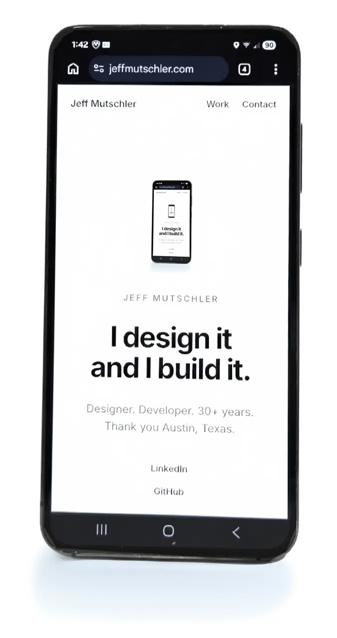
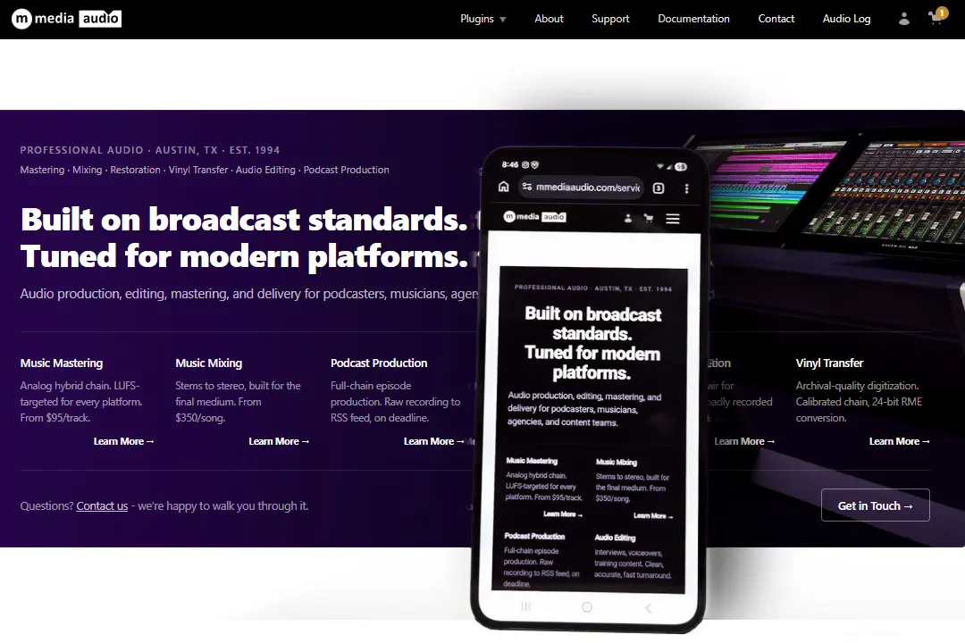
M Media Audio - Custom WordPress Theme / UI/UX / WooCommerce

M Media Audio was designed as a polished portfolio and product storefront for professional audio software. The goal was to present three VST3 plugins, audio services, support resources, documentation, and e-commerce in one cohesive system without making the site feel like a generic WooCommerce install.

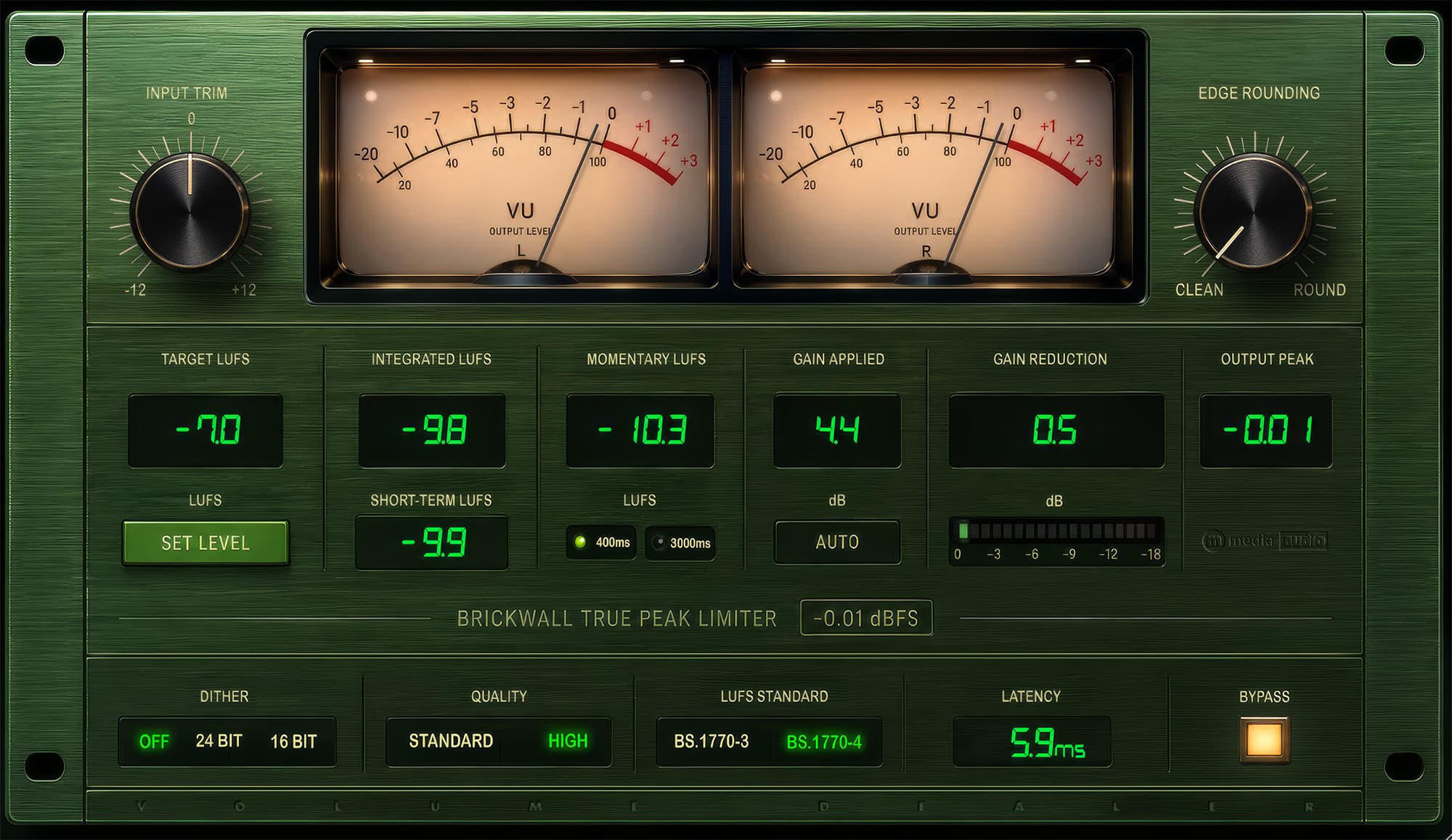
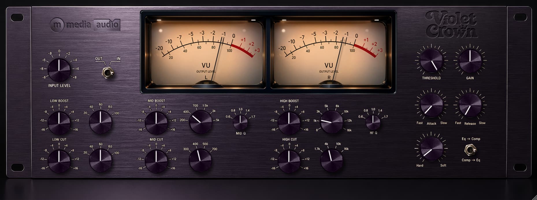
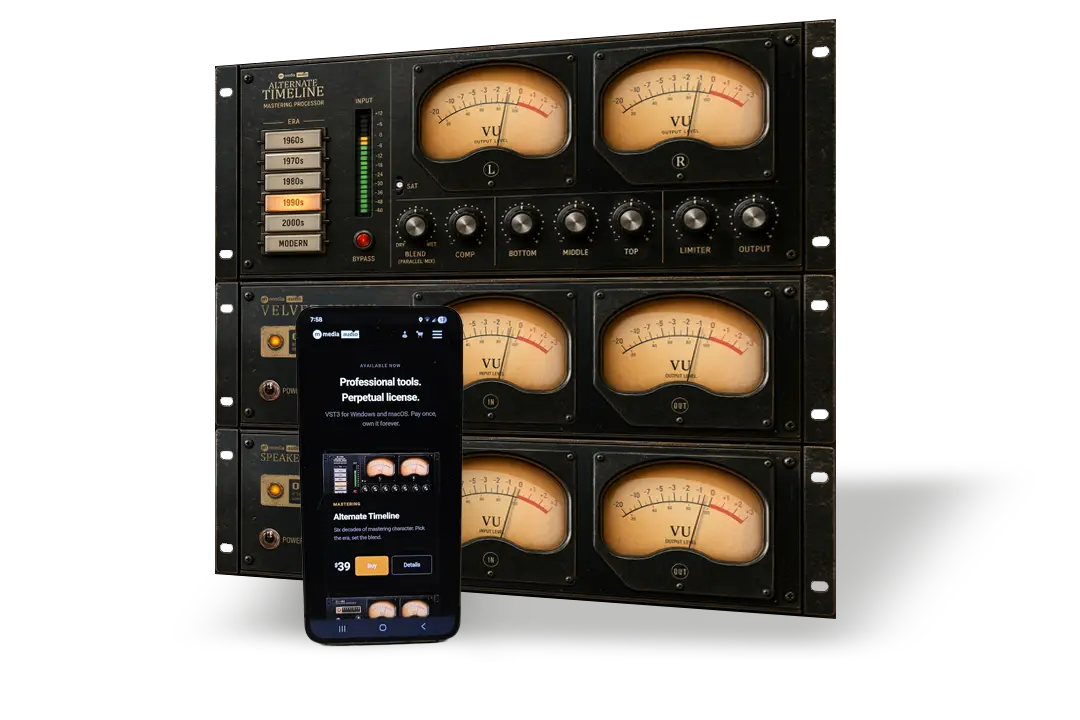
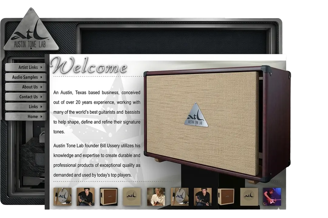
The visual direction uses a restrained dark interface, near-black surfaces, amber accents, Apple-style spacing, system typography, and large cinematic product imagery. The result is a premium audio brand that feels closer to high-end studio hardware than a typical plugin sales page.

The site was built as a fully custom WordPress theme with no page builder, no CSS framework, and no block-editor layout dependency. I designed and implemented the component system, including the hero sections, plugin cards, animated compatibility logo rail, product slider, service sections, navigation, responsive layouts, and reusable dark/light section patterns.

Interactive elements were built with vanilla JavaScript, including the product slider, mobile navigation, swipe support, auto-advance behavior, conditional form sections, and accessibility states. The theme uses a single organized stylesheet and custom PHP templates throughout.

The site includes three purpose-built intake flows: a general contact form, a project-start form with conditional service fields, and a structured plugin support form collecting product, OS, DAW, license, version, issue details, and attachments. Forms use WordPress nonce validation, honeypot protection, private file handling, and email delivery without relying on third-party form services.

WooCommerce was integrated into the design system instead of left in its default state. Cart and checkout pages use custom templates, branded headers, checkout step indicators, trust messaging, custom table styling, matching form fields, and a continuous visual experience from product discovery through purchase.

The project demonstrates full-stack WordPress execution: information architecture, visual design, UI/UX, responsive front-end development, PHP templating, WooCommerce customization, form handling, product presentation, and performance-conscious JavaScript without unnecessary dependencies.

SRO Records

SRO Records

The SRO Records storefront was designed from the ground up as a worldwide collector-first eCommerce experience, balancing dense inventory browsing with immediate trust signals.

The homepage layout leads with a full-width search bar surfacing all 6,452 listings, flanked by condition-graded product cards that surface the grading data collectors actually make purchase decisions on. Typography and color choices - a warm off-white field, gold accent on genre headings, dark hero band - reflect the aesthetic language of the vinyl world without resorting to cliche.

Responsive layout was a primary constraint, not an afterthought. The mobile breakpoint collapses the multi-column product grid to a clean single-column feed while preserving the search-first hierarchy and Latest Arrivals sidebar as a stacked stream. Navigation condenses to a hamburger without losing the genre and label taxonomy that drives collector discovery. Both viewports were designed in parallel to avoid the common trap of desktop-first layouts that break under compression.

The trust layer was deliberately woven into the content hierarchy rather than isolated to a dedicated section. Verified buyer reviews appear inline at the browse level, the seller narrative is positioned above the fold adjacent to product listings, and condition/grading metadata is visible on every card without requiring a click. This reflects a UX strategy grounded in how collectors actually evaluate sellers - through accumulated micro-signals of credibility rather than a single conversion element.

General Motors

General Motors

The 2014 Valukas Report - the independent investigation into GM's ignition switch crisis - documented how a single engineer approved a design fix for a defective switch but failed to assign a new part number, making the change invisible inside GM's own tracking systems.

The defect had been known for over a decade. One hundred and twenty-four people died. The part number was never updated. The internal systems were so poorly built that a safety-critical change could disappear into them without a trace. When GM hired me that same year to rebuild the UI layer of their global supplier management systems, the state of those interfaces was not a surprise. They looked like they were built by 3rd party software engineers who had never thought about the person on the other side of the screen. Because they were.

Over 60,000 global suppliers used these systems every day to manage quality, sourcing, and performance data at the scale of one of the largest manufacturers on earth. Legacy JSP with no design system, no component architecture, no coherent visual language, built erratically by third-party vendors over years with no continuity. The interfaces communicated nothing clearly and forgave nothing. That is not a UX complaint. At GM's scale, an interface that obscures information or creates ambiguity is an operational liability. The Valukas Report proved it.

Over nine years I rebuilt the entire UI layer. JSP gave way to Angular. Ad-hoc styling gave way to Angular Material. Then the work outgrew what Material provided - I designed and built custom components that extended the library well beyond its published spec, maintaining consistency and quality across three interconnected enterprise systems. Over my time there, I mentored over 40 developers and drove roughly 30% velocity improvement across the teams I worked with. That number is not an estimate; it was measured.

When GM stood up their Defense division on a classified platform, they ported the work. I do not hold a government security clearance - GM vouched for me directly. I cannot show screenshots of any of it. Some of the most significant work of my career exists behind an NDA and a classification level, which I will take as a compliment. The details are available in conversation.

Bob Olhsson Audio Mastery

Bob Olhsson Audio Mastery

Bob Olhsson started at Motown Records in Detroit in 1966, where he recorded and mixed some of the most recognized music in American history.

After Motown left Detroit he followed his own path - San Francisco, then Nashville - building a decades-long independent career in mastering, mix evaluation, and audio for picture. By the time we worked together, his professional credibility was enormous and his web presence wasn't keeping up. The site needed to feel like the front door to a serious operation, not a WordPress template with a headshot.

The logo centers on a spiral motif - referencing both the physics of sound and the proportional geometry that runs through the best-designed studio hardware of Bob's era. Warm gold against dark charcoal sets the palette: premium, analog, Nashville. NASHVILLE sits as a deliberate sub-element of the lockup, positioning Bob within the industry geographically rather than treating location as a detail. Everything was built to communicate in the first five seconds that this was a career built on records that sold in the hundreds of millions.

The site functions as a working studio portal. The discography is surfaced in primary navigation - a deliberate choice that puts Bob's Motown-era credits in front of every visitor before they reach the services page. A file upload system handles client project delivery directly through the site, keeping the entire client relationship inside the studio's own infrastructure. Bob is also a prolific writer with strong opinions about recording and the music business, so the content architecture gives those opinions a platform - which doubles as the authority signal for anyone arriving cold.

Austin Tone Lab

Austin Tone Lab

Bill Ussery built guitar amplifiers the way the best ones have always been built - by hand, one at a time, for musicians who can hear the difference.

Austin Tone Lab's clientele included Eric Johnson and David Grissom, two of the most tonally demanding guitarists working. When you're making gear for players at that level, the brand has to carry the same weight as the product. A stock logo and a template site would have been an insult to the work.

The logo is a triangle - a shape that reads immediately as badge hardware, the kind of embossed metal plate bolted to the grille cloth of a serious amplifier. The ATL letterform inside it is tight and authoritative. Dark textured backgrounds reference cabinet tolex and speaker material. The silver metallic navigation buttons borrow their finish language from amp panel hardware. None of this is accidental - every visual decision was made to make the site feel like the product feels when you stand in front of one.

The full scope covered logo design, brand identity, wireframing, design, build, and hosting through M Media. Audio samples let the amps speak for themselves, and artist links connected visitors directly to the musicians using the gear - a credibility chain that worked because the names on it were real. Bill knew exactly what he was building. The job was to make sure the brand did too.

GarrettCom

GarrettCom

GarrettCom made industrial-grade networking hardware for environments where failure is not an option - power substations, LAPD cruisers, nuclear plants, highway traffic systems, factory floors.

The brand had real credibility in the field, but the visual identity and web presence hadn't kept pace with the seriousness of the product. The work covered logo refinement, brand standards, marketing collateral, and full website design across a product line that included managed and unmanaged switches, routers, terminal servers, serial converters, and cyber security hardware. Documentation was the core of the customer experience - every application note, product selector, spec sheet, and support archive had to be surfaced clearly, because the engineers and procurement teams buying this equipment were not browsing, they were specifying. The information architecture reflected that.

Belden acquired GarrettCom and eventually absorbed the brand entirely into its own identity - which is the unsentimental ending to a successful engagement. The work held up well enough to survive the transition and influence how a much larger company presented a product line to industrial buyers. That same appetite for enterprise-scale complexity was the thing that pointed me toward GM - toward what it looks like when the infrastructure challenge is not a product line but sixty thousand global suppliers.

The Womb

The Womb

The Womb was not necessarily a public forum - it was more of an invitation-only community built around the idea that real knowledge in pro audio lived with the people who actually made the records, not on the sanitized boards where those conversations got watered down.

Mixerman (Eric Sarafin - gold and platinum mixer for The Pharcyde, Ben Harper, Lifehouse, Barenaked Ladies) had built a following through The Daily Adventures of Mixerman and his Zen series of books. Slipperman's legendary Recording Distorted Guitars From Hell had become required reading in heavy music circles. These were the anchors, but the room also included Bob Ohlsson, Ken Scott (the Beatles engineer), Ron Saint Germain, and a rotating cast of serious working engineers operating under aliases. I was crunch. The whole post-it notes design premise came from my wife Eli, who drew every visual element by hand on actual Post-it notes. I digitized the drawings, composed the collage header, and built the full system - art direction, graphic design, and sysadmin. That header is not a digital recreation of Post-it notes. It is Post-it notes - many were made.

It ran for years as the anti-Gearslutz - no corporate moderating, no gear company influence, no beginner apologetics - and it mattered in the industry in ways that didn't show up in Google results. When it eventually wound down and the community migrated elsewhere, it left a gap that nobody has quite filled. For me it was the rare project where the design concept was physically true: the medium was the message, and the medium was a stack of hand-drawn notes from someone who understood the room. We had so many laughs together. Long Live The Womb.

2000s
2000s
Buttercup Dental

Buttercup Dental

Buttercup Dental was the first - the first of what became hundreds of dental websites built for the ChrisAd Agency, and it set the template for everything that followed.

Dr. Scott Smith in Cedar Park had a clear picture of what his practice should feel like before most dental offices thought about that at all. The orange Texas star logo, the warm photography, the patient login system, the appointment scheduler, the new patient intake forms wired directly into the practice workflow - none of that was off the shelf in 2009. This was pure LAMP: custom PHP, MySQL, Apache, Linux, built from scratch at a time when that meant actually knowing what you were doing. The visual design deliberately pushed past the bevel-and-drop-shadow aesthetic that defined most medical web work of that era. Clean nav, real photography, justified body copy, a hero that felt like a practice you would actually trust with your family.

What made Buttercup Dental matter as a project was not the site itself but what it proved. A dental practice with the right design and the right online infrastructure could outperform larger competitors on first impression alone. Dr. Smith understood that, and the ChrisAd relationship that grew from it put the same logic in front of hundreds of practitioners across the United States. The site was the proof of concept for an entire production model.

Austin Screen Printing

Austin Screen Printing

Austin Screen Printing had been an Austin institution since 1975 - born out of the back of Rooster Andrews, printing jerseys for UT and local sports teams before most of their competitors existed.

By the time we came on board they were the largest full-service screen printer in Austin and had grown to include embroidery and promotional products alongside their original trade. They had their own internal graphics department. We ignored that entirely and designed a site that treated them like the cultural institution they actually were. The palette is deep forest green and weathered khaki - Austin outdoors, not corporate print shop. The navigation buttons are styled like crosshair targets. The scroll ironwork in the sidebar pulls from the decorative Austin signage tradition. The full-width portfolio strip at the bottom showcased their real client list - SXSW, Austin Film Festival, South Congress - because the names were better than anything we could write. It outclassed their internal work by a significant margin, and they knew it.

The site handled artwork uploads, order status tracking, quote requests, a full client catalog organized by category, brand, and industry, and a mailing list system - all custom LAMP, all integrated, all running behind a design that made a print shop feel like a brand. They have since moved toward the generic "your logo on anything" model that commoditized the industry. For a few years though, they were the kings of screen printing in Austin, and the site looked exactly like that.

Odyssey Pro Sound

Odyssey Pro Sound

In the 1990s, if you ran a recording studio anywhere in the United States, you knew Paul Savasta and you knew Odyssey Pro Sound.

Paul built his reputation the hard way - starting in 1993 as a trusted source for quality used and vintage pro audio gear, the kind of shop where a studio owner could call, describe what they were looking for, and trust that what arrived was exactly what was represented. That reputation expanded into new gear over time, with brands like API, Chandler Limited, BURL, Millennia, Manley, and Empirical Labs, while never abandoning the used and vintage side that built the name. The design had to carry that same credibility. The dark space backdrop was deliberate - pro audio is serious work, and the site needed to feel serious before a single product was clicked. Full e-commerce with manufacturer filtering, trade-in programs, lifetime support, free extended warranty, zero-hassle returns, and easy financing - all of it had to be present and accessible without overwhelming the shopping experience.

What made Odyssey different from every big-box competitor who eventually commoditized the market was the same thing that made Paul's phone ring for thirty years: people trust him. The site was designed to communicate that trust immediately - not through testimonials or badge graphics, but through the tone of the copy, the quality of the product presentation, and the fact that a toll-free number sat at the top of every page. He's still there, still fighting razor-thin margins against online giants, still answering the phone. Some things don't need disrupting.

The Orthodontic Clinic

The Orthodontic Clinic

Some projects are business. This one was closer to a gift.

Dr. Adeola Faleye was building an orthodontic practice in Bartlett, Tennessee - a suburb of Memphis - with a clear and deliberate philosophy: everyone is welcome. Children, adolescents, adults, LGBTQ patients, every background. In Memphis, in that era, that was not the path of least resistance. It took courage to open a practice on those terms and mean it. The site had to communicate that warmth without making it a statement - the goal was a place that felt safe to walk into before a word was read. The multi-colored navigation bar was intentional. The hero image was intentional. The copy was intentional. None of it was accidental inclusion; it was a considered design position that said the same thing the doctor was saying with her practice.

The full scope covered branding, identity, and the complete website - Meet Dr. Faleye, staff pages, benefits of braces, patient education, FAQ, contact, and location, all organized for a patient who might be anxious about orthodontic care and needed the site to lower that anxiety before the first appointment.

ALCO Print Finishers

ALCO Print Finishers

Print finishing is everywhere now - UV coating, lamination, die cutting, foil, folding and gluing are standard offerings at dozens of shops across the country.

ALCO Print Finishers in Tulsa, Oklahoma was the largest print finisher in the United States, operating a full state-of-the-art manufacturing facility at a scale nobody else in the trade could match. Their client list included FedEx Kinko's. Their services covered the full spectrum: film lamination, UV liquid coating, die cutting, glue mounting, folder gluing, and additional specialty finishing. The printers who chose ALCO did so because the work came back right, on time, and at a price that didn't require explanation to accounting. That was the brand promise, and it was real.

The logo came with the client - not our work, and it showed. Everything else was ours. The site architecture was built around the way commercial printers actually make decisions: they arrive knowing what process they need, they want to understand capabilities quickly, and they want a case study or a sample that proves the shop can execute at their level. The FedEx Kinko's case study on the homepage was deliberate placement - it told every mid-market printer arriving on the site that the largest print buyer in the country had already solved their trust problem for them.

None of ALCO's competition had anything close to this web presence. The industry was still operating on brochure-ware and trade show relationships. ALCO got a site that read like a serious manufacturing operation rather than a local print shop, with service pages organized by process, real photography from the production floor, and an employment section that signaled scale. The site did exactly what it was supposed to do: make the largest print finisher in the country look like the largest print finisher in the country.

National Treasury Employees Union

National Treasury Employees Union

NTEU Chapter 247 represents IRS employees in Austin, Texas - part of the National Treasury Employees Union, which covers 150,000 federal workers across 34 agencies and departments.

This one was essentially a gift. The site went out the door for pennies, and that was the point. What it gave back was something harder to bill for - a ground-level education in collective bargaining, how union chapters actually function, what federal employees deal with in a workplace that runs by a different set of rules than the private sector, and what it looks like when a group of people with very limited resources fight very hard for very basic things. Chapter 247 had a 70% dues-paying membership rate, which is a remarkable number and says everything about how much their members trusted the organization.

The site is still up, largely unchanged. That is either a testament to how well it held together or a sign that the chapter has had bigger things to worry about. Probably both. Not every project in a career is about the fee or the showcase. Some of them are about showing up for people who need it, learning something you couldn't have learned any other way, and doing the work right regardless.

JavaJive Recording Studio

JavaJive Recording Studio

Dave Martin owned JavaJive for close to 25 years - ten secluded acres in Joelton, Tennessee, twenty minutes from Nashville's Music Row, with production and engineering credits running from Old Crow Medicine Show and the Fisk Jubilee Singers to Porter Wagoner and Nokie Edwards of The Ventures. His session bass credits include Steve Vai, Adrian Belew, Rick Nielsen of Cheap Trick, Eric Johnson, Robben Ford, and Robert Earl Keen, among many others. He is a member of the Western Swing Hall of Fame, both as a historian of the genre and for the recordings he produced, played on, and engineered. This was a serious room with a serious resume.

The identity work had to match that weight. We built the JavaJive brand around the coffee grinder mark - warm, tactile, and intentionally analog in feel - and carried it through the full site. The instrument photography strip across the homepage was deliberately chosen: drums, piano, upright bass, guitar, all shot warm. Not a flashy studio-tech aesthetic, not stock photography. The navigation was clean because the content didn't need help. The site said exactly what a studio at that level should say.

Working for clients in the music industry at this tier is different from working in other industries. The audience is not general; it is specific and experienced, and it reads everything through that filter. A Nashville recording studio with Dave's resume had to look credible to people who had been inside Blackbird and Ocean Way and every other serious room. It had to belong in that world without overselling itself.

Cuppa Joe Records

Cuppa Joe Records

Cuppa Joe Records was Dave Martin's boutique label, a companion to JavaJive Studio - the natural next step for a producer and engineer who spent 25 years recording music he believed in and eventually decided to release some of it himself. The label was deliberately genre-agnostic. The site copy says it plainly: "Cuppa Joe isn't a country label. Cuppa Joe Records chooses instead to release projects that we think are absolutely marvelous, without regards to how the music might be pigeonholed." That is a harder position to design for than a label with a defined sound, because the brand has to carry weight the genre can't.

The identity built on the coffee house metaphor fully - warm browns, black, and cream; a coffee cup mark with steam curling into the wordmark; mixed display and editorial typography. The site architecture covered news, artists, downloads, a store, and an MP3 listen section at a time when streaming wasn't a given and getting audio samples in front of listeners took real infrastructure decisions. The label's debut release was Carolyn Martin's "The Very Thought Of You," a standards record. The site had to make that feel like an event worth paying attention to.

A boutique label site in this era was doing a lot of things at once: building credibility for artists who didn't have major label marketing behind them, creating a destination that music press and radio could point people toward, and running e-commerce for a catalog that was still being built. The design had to suggest permanence and taste without pretending the label had a back catalog it didn't. That is a specific kind of problem, and the coffee house aesthetic solved it cleanly.

Trash Rock Kings

Trash Rock Kings

Trash Rock Kings played like they were the last band on earth - nitro-burning, head-bobbing Texas rock for people who live hard and party fast, walls of Marshalls on either side of the stage and beer bong girls flanking both ends.

Gut-wrenching, full-throttle, dirty, loud, and dangerous. Texas Motorhead crossed with 20% David Lee Roth and 3 cases of Lone Star. Mass hysteria and extended drinking were not side effects; they were the point. By today's standards they would have been arrested several times over. By the standards of the time, they were exactly right.

The CD artwork across four releases - including the green first record and "Tres Diablos" - built a consistent visual universe around a recurring cast: a devil woman pin-up, a pack of three trash rock devils, hypnotic spiral backgrounds, and a rotating cast of scenarios that kept the brand recognizable across releases without going stale. The black self-titled cover is pure confidence - nothing but the band name in hand-lettered gothic on flat black. The "Austin, Texass" sticker with its hot rod illustration and that deliberate double-S says everything about the band's relationship with authority. All of it - the CDs, t-shirts, posters, stickers - landed in the right hands at the right shows - merch vanished instantly.

Counter-culture design runs in both directions: too polished and the audience smells a poser, too sloppy and it just looks cheap. The goal is controlled danger - something that reads authentic without being accidental. The Trash Rock Kings catalog is as consistent a visual identity as any band at any level. Every piece belongs in the same universe. That does not happen by accident, and it does not happen without a client who trusts the instinct completely.

Austin Pianoworks

Austin Pianoworks

Austin PianoWorks has been serving Central Texas since 2000 - tuning, repairs, rebuilding, and appraisals - and their client list reads like a cross-section of everything that makes Austin Austin.

Jim Eno of Spoon. Austin State Hospital. The Vortex. Hyde Park Presbyterian. Cacophony Recorders. The Shire Recording Studio. Recording studios, churches, schools, hospitals, and working musicians, all trusting the same shop with instruments that in some cases are over a century old. That is a credibility profile that takes years to build and cannot be faked.

The design matched the work: parchment backgrounds, Victorian ornamental borders, period-appropriate script lettering in the Austin PianoWorks logo, and typography that respected the age of the instruments being restored. A piano technician working on an 1870 Steinway Square Grand should not have a website that looks like a tech startup. The aesthetic said craftsmanship, patience, and expertise - which is exactly what someone buying a $20,000 rebuild needs to feel before they hand over the keys.

What made the site genuinely ahead of its time was the architecture underneath the surface. A live Current Projects panel displayed active restorations by year and model - a 1933 Shubert baby grand, a 1924 Mason & Hamlin AA 6'2" - giving customers real-time visibility into the shop's work. Online appointment scheduling, a client portal, a full FAQ, a Piano Info educational section, and a Pianos For Sale inventory rounded out the feature set. In 2001, most service businesses had a phone number and a paragraph. This was a full-service customer experience built for a one-person shop. That gap was the whole point.

Balcones Dermatology

Balcones Dermatology

Five board-certified dermatologists under one roof on N. Mopac - Drs. Farady, Curry, Jackson, Kaiser, and Bushore - each with opinions about what the practice's website should look like, none of them wrong, none of them in complete agreement.

Dermatology Associates offered the full scope: medical and surgical dermatologic care, skin cancer diagnosis and treatment, phototherapy for psoriasis, cosmetic procedures, laser treatment, collagen therapy, and Botox. That breadth of services required a site architecture capable of organizing everything without making any single physician or specialty feel like an afterthought. We built the whole thing.

The logo solved the identity problem cleanly - a road or path integrated directly into the B of Balcones, tying the practice name to a visual metaphor about the journey toward care. The color palette ran blue and gray, clinical without being cold, approachable without being casual. The group photograph of all five physicians in white coats anchored the homepage and said something that copy alone cannot: these are real people, there are five of them, and they are credentialed. "Proudly Serving Central Texas" is not a tagline you earn by default.

The site architecture handled genuine complexity. A hierarchical left-sidebar navigation organized individual physician profiles, cosmetic services, updates, patient handouts, and insurance information in a structure that could scale as the practice grew. Online new patient registration and downloadable release forms were features that most medical practices were not offering in this era. That kind of functional investment signals confidence and saves staff time on every single new patient intake.

Multi-principal client engagements teach things that single-decision-maker projects cannot. When five physicians are signing off, the design instinct that matters most is knowing which decisions to protect and which ones to let the room decide. Clinical clarity, patient trust, and site architecture are not negotiable. Color preference and header font weight are. Balcones came out right. The practice ran that site for years, which is the only metric that matters for a medical office.

Mixerman

Mixerman

Eric Sarafin - Mixerman - is one of the most influential voices in pro audio of the last twenty-five years: platinum-level producer and engineer, author of the Zen and the Art of Mixing series published by Hal Leonard, and the person behind the Daily Adventures of Mixerman, the anonymous online diary of a major-label recording session that became required reading in studios everywhere before it became a book.

His audience is not casual. It is working engineers, producers, and musicians who can hear the difference between competent and extraordinary, and who apply the same filter to everything else they encounter - including the visual presentation of someone they trust for professional guidance. Designing for that audience is a specific kind of pressure.

The relationship covers the full range: website, branding identity, book covers, advertising. That kind of long-term creative partnership is different from a single project engagement. You develop shorthand. You understand what the client's instincts are, where they have strong opinions, and where they want to be surprised. With Mixerman the constraint is always that the work has to feel credible to an audience that does not give credibility easily. The Mixerman brand operates at the intersection of professional authority and irreverence - opinionated, technically rigorous, and not interested in being polished for the sake of it.

Book cover work for a Hal Leonard publication reaches a different audience than a website does. It lands in music stores, school catalogs, and publisher listings alongside everything else in the Hal Leonard catalog. It has to work at thumbnail size and at full bleed. The Zen series covers had to signal both the technical depth of the content and the voice of the author - someone who knows exactly what he is talking about and will tell you so directly. That is a harder design brief than a straightforward instructional book cover.

The advertising and identity work extended the same visual language across platforms and formats over years. Maintaining consistency for a personal brand across that kind of timeline, while the brand itself evolves as the author publishes more work and builds more credibility, requires a working relationship built on trust in both directions. The credits accumulated on this one. That is what a client looks like when the work is right from the beginning.

1990s
1990s
Dell Support

Dell Technologies

Dell Technologies in Round Rock, Texas was one of the fastest-growing companies on earth in 1995 - shipping millions of PCs while simultaneously trying to support every customer who called in with a hardware problem they couldn't diagnose.

As Senior Application Developer and Web Technologist II from 1995 to 1999, the scope of the work was not small. support.dell.com, DellTech (the internal infrastructure site housing every tool the support organization needed), the Multiple Program Simulator, and a hardware troubleshooting series that served as the linear diagnostic framework for the entire support staff. The trophies are real. There are several of them.

The central innovation was delivering troubleshooting applications as HTML so support staff and customers didn't have to install software to diagnose problems. In 1996 and 1997, that was not an obvious solution. Installing support applications on customer machines created support calls about the support software. Delivering the same functionality through a browser eliminated an entire category of friction and put the tools where the people already were. The ~40% efficiency improvement that followed was not an accident; it was the direct result of meeting users at the interface they already understood.

DellTech consolidated the infrastructure layer - all the tools, all the documentation, all the internal resources - into a single coherent system that the support organization could actually navigate. At the scale Dell was operating, disorganized internal tooling is not an inconvenience; it is a measurable cost per call per agent per hour. The architecture behind DellTech was built to eliminate that cost systematically. The hardware troubleshooting series brought the same logic to the diagnostic side: linear, consistent, testable, deployable across an entire support floor without retraining.

The work at Dell was the first real exposure to what software looks like when it operates at scale - not dozens of users, not hundreds, but a global support organization with tens of thousands of daily interactions flowing through systems that had to be right. That experience shaped everything that came afterward. The trophies are on the shelf. The instincts are still in use.

Willie Nelson, Soundgarden, Windows NT 4.0

Willie Nelson, Soundgarden & Windows NT 4.0 Server Support site

Three projects, one era, one clear signal: in 1995 the web was becoming real, and the people who understood that earliest got to work on things that mattered. Willie Nelson's first website. Soundgarden's Superunknown promotional site - the album that went to number one on the Billboard 200 and produced "Black Hole Sun" and "Spoonman." And the interface work for Microsoft's Windows NT 4.0 Server support site. These were not small clients hedging their bets on a new medium. These were serious organizations making serious commitments to the web before most of their peers understood what it was.

Building Willie Nelson's and Soundgarden's first web presences meant working without a template for what an artist website should be, because there wasn't one yet. There was no established convention for how a country legend or a platinum grunge band should present themselves online. The design decisions made in those projects were not adaptations of existing patterns - they were the pattern. What music on the web looked like in the mid-90s was, in part, determined by work like this.

The Windows NT 4.0 Server interface work was the enterprise side of the same inflection point. Microsoft was building the infrastructure of the modern corporate network, and the support system for it had to be as serious as the product itself. Designing interfaces for that environment while simultaneously building artist sites for two of the most recognizable names in American music is an unusual combination. It is also an accurate description of what the first generation of professional web work actually looked like - everything was new, the clients were real, and you figured it out.

Clients & Collaborators

Most of these logos were designed by me.

Languages, Platforms & Tools

Thirty-two years of languages, operating systems, design tools, and creative software - the ones still in daily use and a few that no longer exist.

Languages

Go Python TypeScript JavaScript PHP Java C++ C C# SQL HTML5 CSS3 Perl Classic ASP JSP ASP.NET WebForms BASIC

Frameworks & Libraries

Angular v4–16 RxJS NgRx Angular Material Flask jQuery Bootstrap Kendo UI WordPress WooCommerce JUCE

Databases & Infrastructure

PostgreSQL MySQL SQLite MongoDB Redis Docker Apache Nginx Jenkins GitHub Actions PCF Ansible BlueOnyx Git

Operating Systems

Ubuntu Debian CentOS Red Hat Fedora Slackware FreeBSD macOS Windows 3.1–11 DOS

Design & Creative

Photoshop Illustrator InDesign After Effects Premiere Pro Figma Blender Quark XPress PageMaker CorelDRAW Corel Painter Aldus PhotoStyler 3D Studio Max

Type Design

Fontographer FontLab Custom typeface design Dell logotype Microsoft (various)

Audio Production

Pro Tools Cubase Pro Reaper Cool Edit Pro Adobe Audition Wavelab Steinberg Nuendo

AI & Machine Learning

OpenAI API Claude / Anthropic API Ollama RAG Pipelines MCP (Model Context Protocol) Whisper Stable Diffusion Tesseract OCR OpenCV LangChain

Thirty-two years in, and the craft is still teaching me things. New tools show up and change what is possible. Old problems come back in new forms and require new thinking. The curiosity that made this work interesting in 1993 is the same curiosity that makes it interesting now. I do not expect that to change.

This page shows the work that can be shown. The rest of it - the process, the reasoning, the things that almost shipped and didn't - lives in conversation. If you have something you're building and you think I can help, there might be a fit, we should talk about it.

Let's talk.

A few questions help me understand what you need before we connect.